

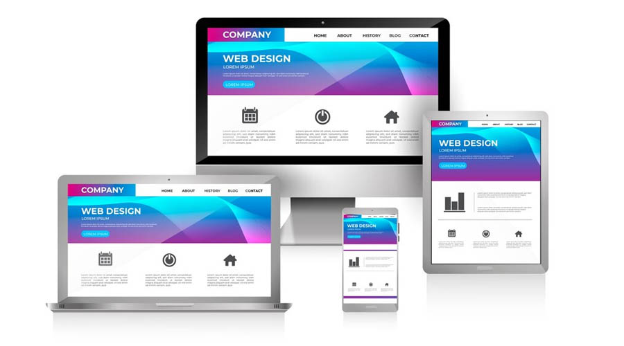
Fully Responsive Websites
Make Sure That Your Website Responds To Your Users' Needs
Responsive websites are the "must have" in today's world. Everyone is using smart phones or tablets to browse and even purchase products so it's vital to ensure your website is responsive-friendly for your customers.
The number of people using mobile devices to browse the web is increasing every day, but most websites are not optimised for mobile devices, such as smartphones, tablets, game consoles and now even watches.
All of these and also future mobile devices are different sizes and your website needs to be designed and coded to show your content clearly on all of them.
How Do Customers View Your Site
Ask yourself why someone would search for you on a mobile? They could be on the move and so they need information or your contact details fast. Or they suddenly remember something they need from you while they are travelling or away from the home. Many people also browse the web on their tablet or smartphone while watching TV or just relaxing at home after work.
You can't treat customers exactly the same whatever device they are using.
Look at your current website on a phone. Look at it from a customer's point of view. Is it easy for anyone to use? Can you see everything easily & clearly?


